Role
Solo Product Design
(self-initiated audit)
Duration
2 Months
Methods
UX audit
Data Analysis (Dune SQL)
Figma Prototype
Research
On-chain data
Reddit user complaints
Usability Walkthrough
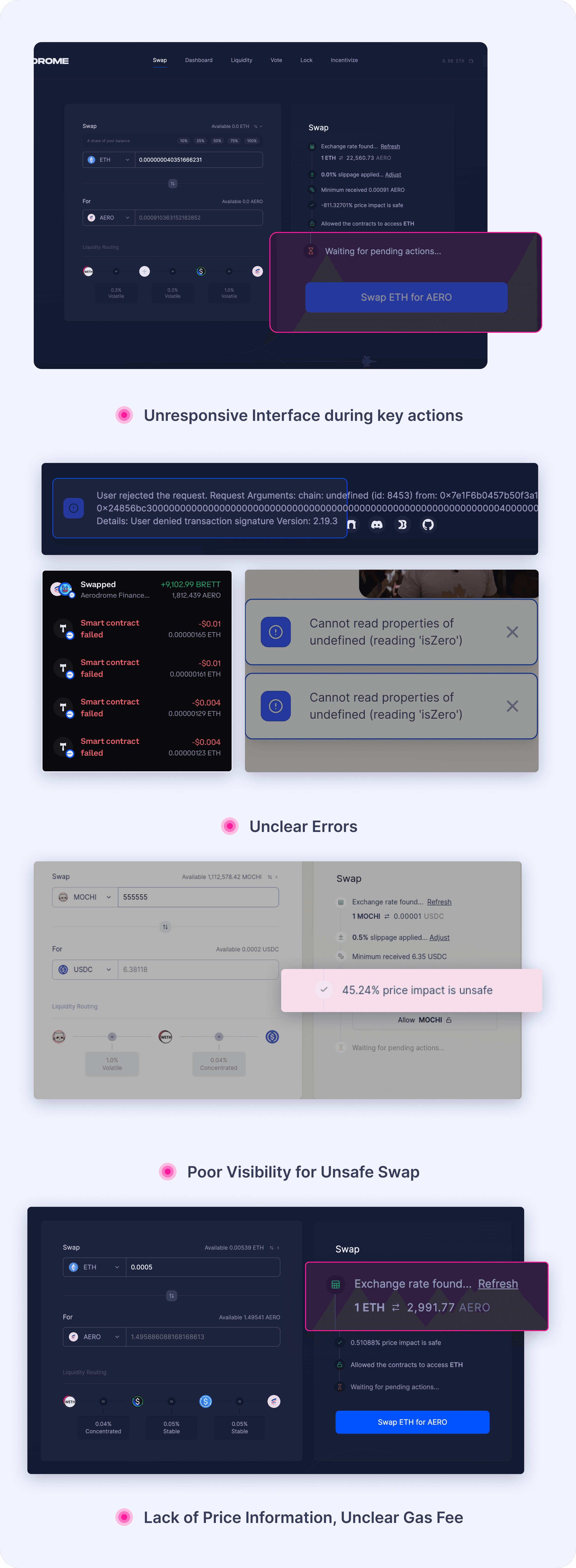
Traders on Aerodrome consistently faced two major UX issues:
Failed Swaps (Primary)
Transactions failed silently or with confusing errors
Users weren’t warned about gas fees, liquidity issues, or quote expiry
Unsafe Swaps (Secondary)
High-risk trades occurred due to hidden slippage and price impact warnings
Some tokens lacked basic metadata (e.g. icons), leaving users unsure if they were interacting with real or scam tokens

Aerodrome Original Website
Quantitative Validation (Dune SQL)
Confirmed widespread swap failures (27,000 swaps), validating that transaction issues were common, not isolated events.
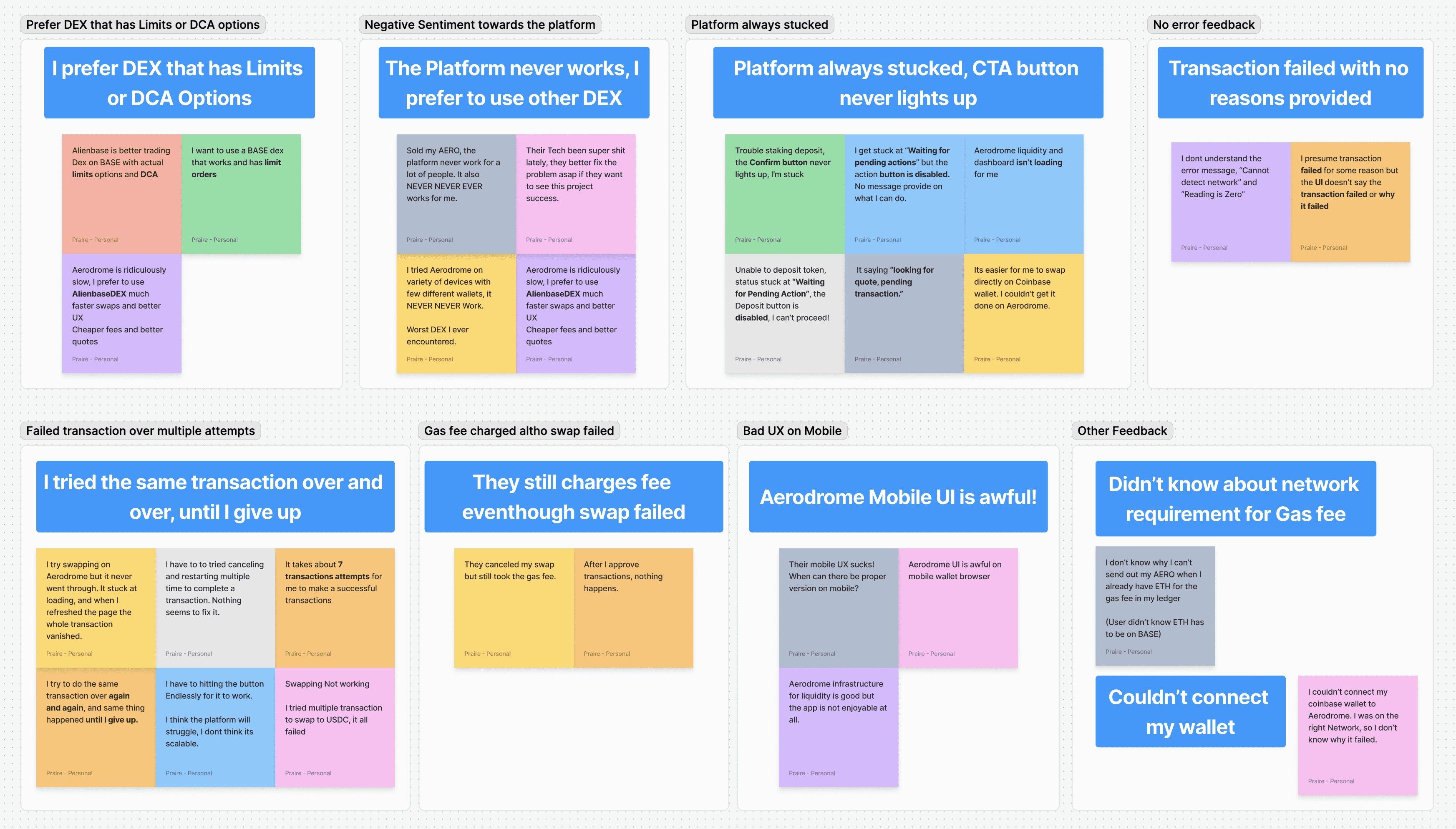
Reddit Trader Complaints (Qualitative)
User comments highlighted frequent silent failures, confusing errors, and hidden risks (like high price impacts).
Live Usability Session (Observation)
Observed a trader repeatedly experiencing unclear transaction failures and confusion about hidden risk settings.

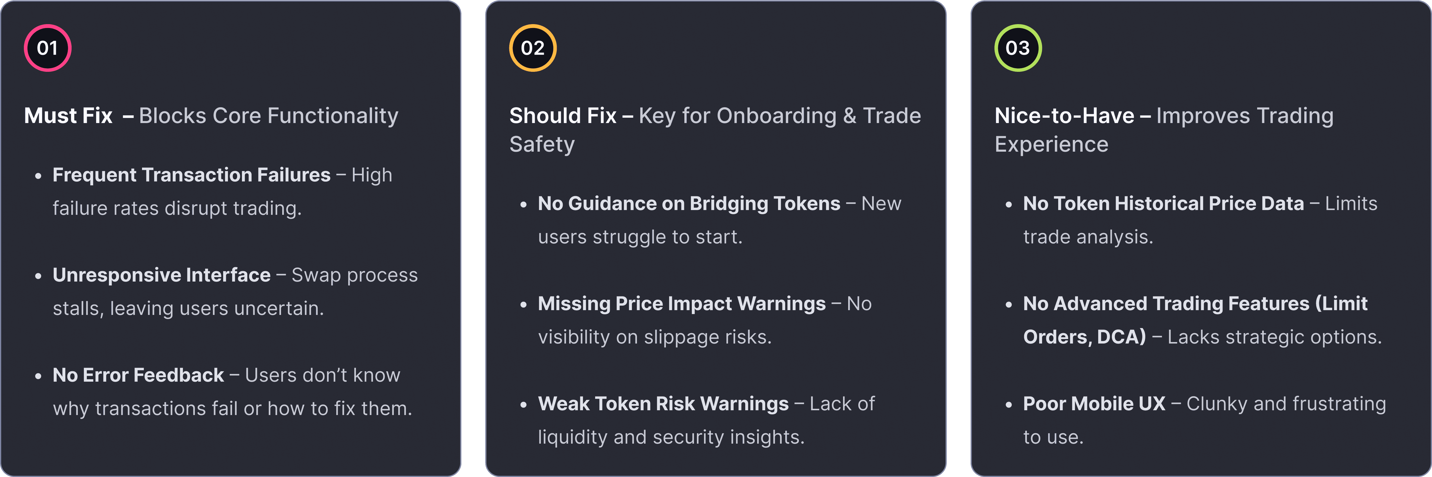
A deeper look into my end-to-end process—from prioritising critical UX issues to competitive benchmarking and iterative wireframing that informed the final solution.
Clear Transaction Error Messages
Clear, human-readable reasons for failures (e.g., gas fees, liquidity) with actionable steps to recover—reducing user guesswork and retries.


Proactive Transaction Risk Indicators:
Risk warnings are surfaced early—highlighting price impact and slippage clearly—so users can make informed decisions before confirming a swap.


Auto-refreshing Quote Protection
The quote now refreshes automatically every 30 seconds—automatically prevents confirmation of outdated rates—without disrupting the user's flow.

What Worked
Users clearly understood transaction flows and error messages.
Critical risk warnings (e.g. gas fees and slippage) were noticed and acted upon, increasing user confidence.
Friction Points
Slippage warnings were clear but could be more contextually anchored (e.g., near the input).
Interface contrast was too subtle, making risk indicators harder to notice.
High price impact trades lacked upfront warnings when Safe Mode was off, leading to missed signals unless settings were manually reviewed.
Iterations
Surfaced slippage and expiry warnings more prominently in the main UI.
Refined the flow for high-risk trades—ensuring guidance appears even when Safe Mode is off.
Improved visual contrast for risk cues, aiding faster recognition and response.
Impact
Users resolved transaction issues more confidently and with less hesitation.
Post-test feedback reflected increased clarity, stronger risk awareness, and smoother trade execution compared to the original version.
As a self-initiated audit, this project challenged me to think holistically—from system-level risk logic to visual clarity—while keeping user safety at the core. I learned how to prioritise and test impactful improvements, even with limited access to real product metrics.
Transparency significantly improves UX: Clear communication of transaction risks, errors, and next-step recommendations notably improved trader confidence.
User-informed prioritisation was crucial: Combining quantitative transaction data with qualitative user insights ensured I addressed the right issues effectively.
Usability testing guided critical refinements: Conducting two rounds of usability testing significantly enhanced the clarity and practicality of my final design solutions.