Renopedia
My Role
User Research
User Interface Design
Timeline
5 Weeks
Team Members
1 Lead Product Designer (Me)
2 UI / UX Designer
Sector
Renovation Marketplace
Lead Generation Platform
Overview

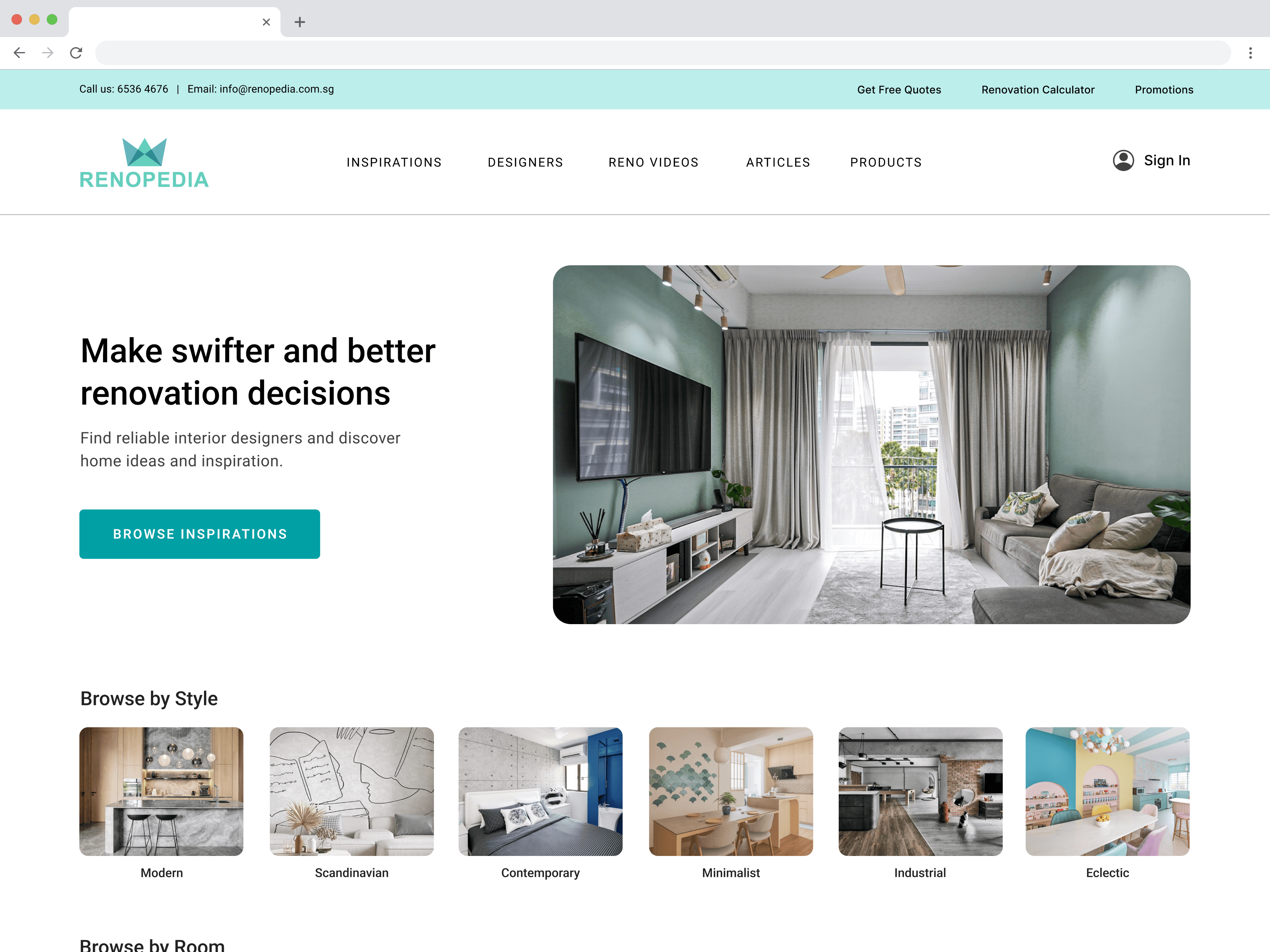
CONTEXT
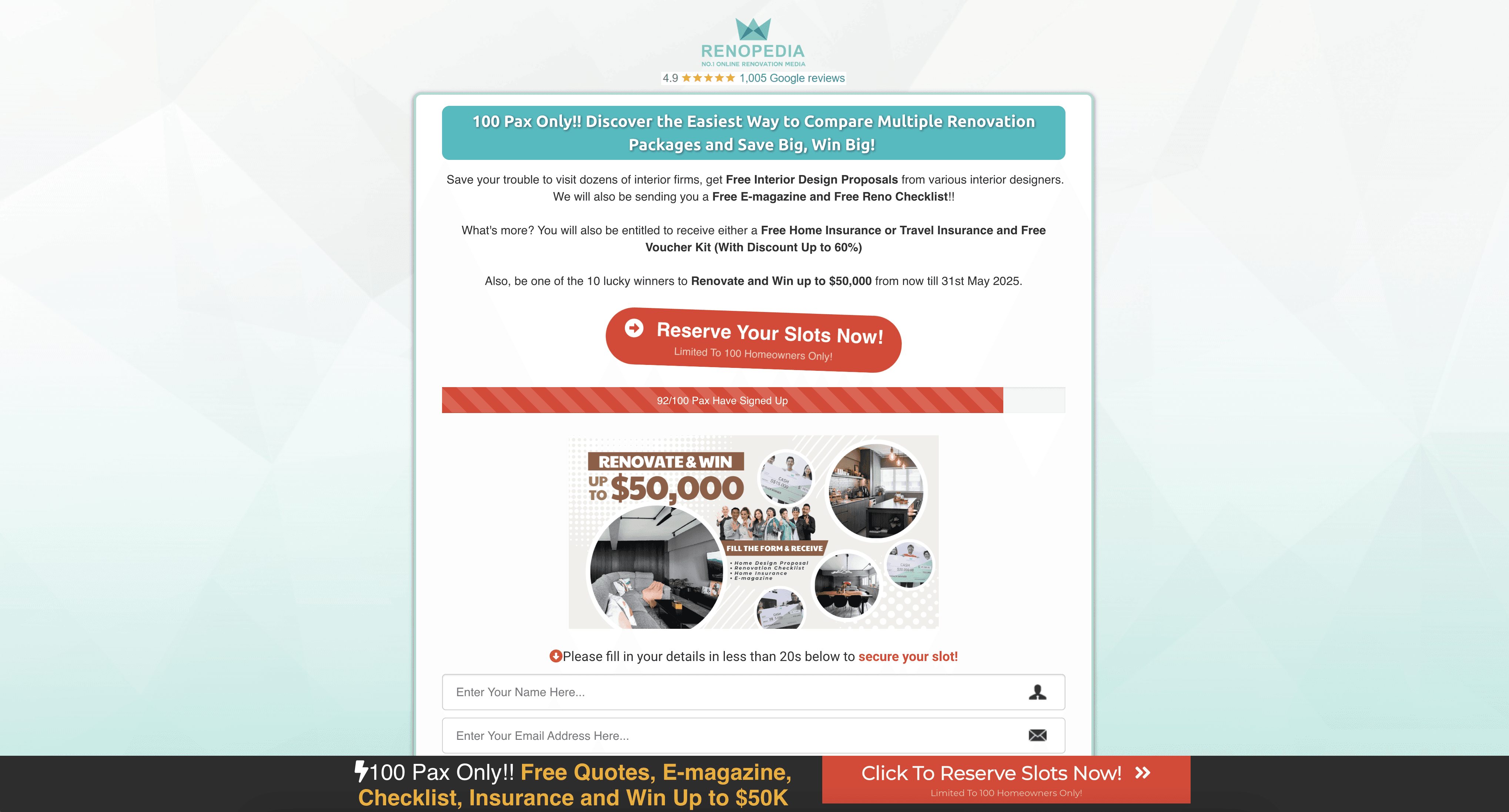
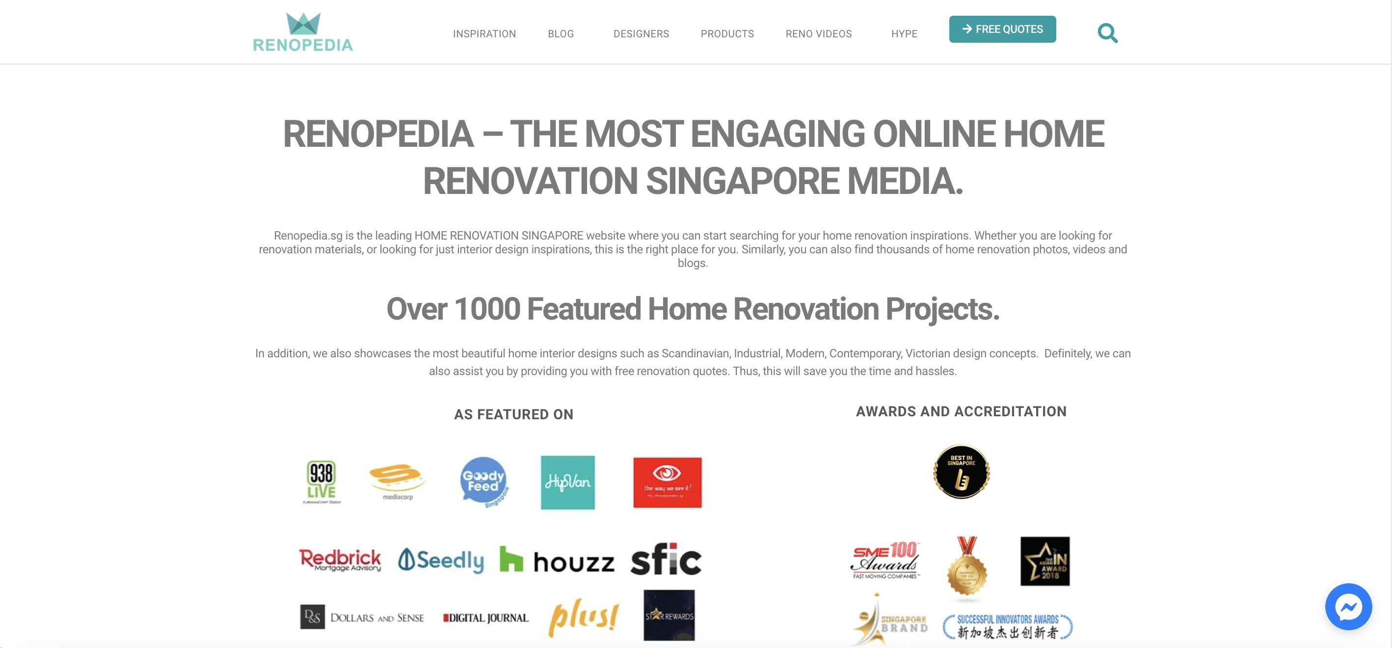
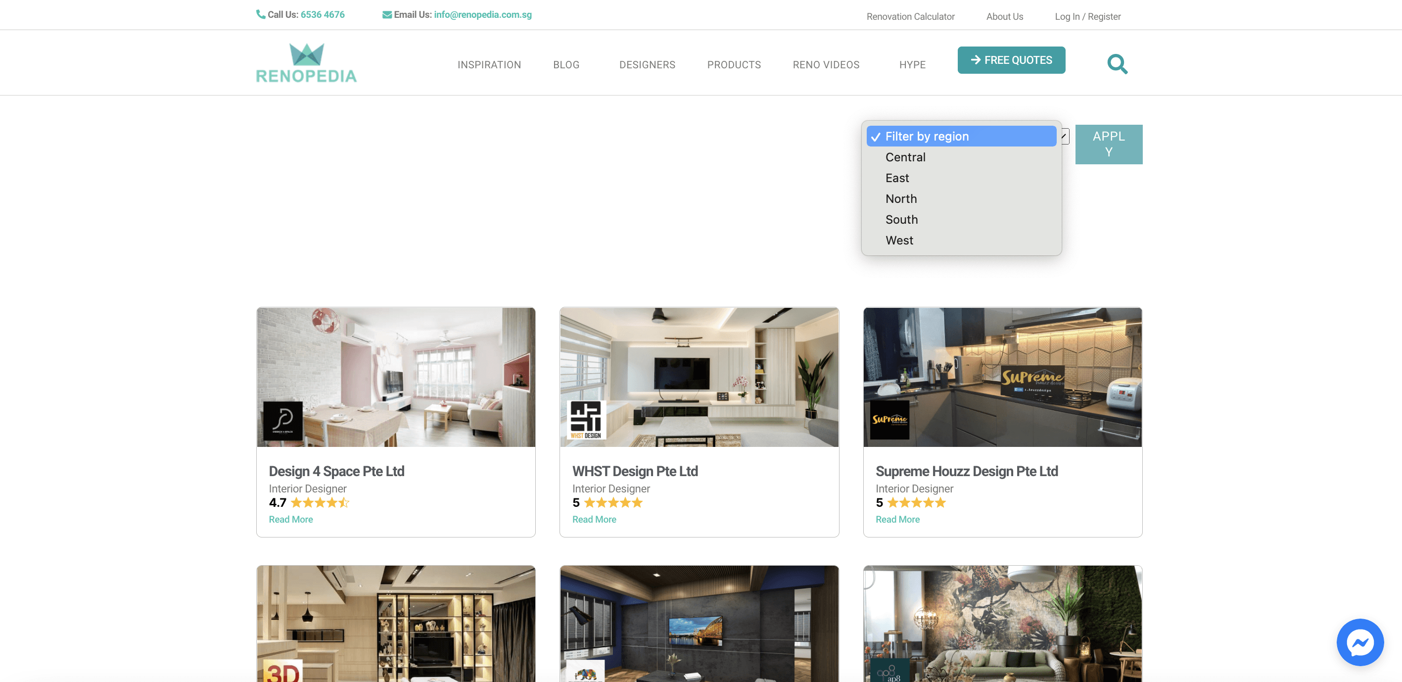
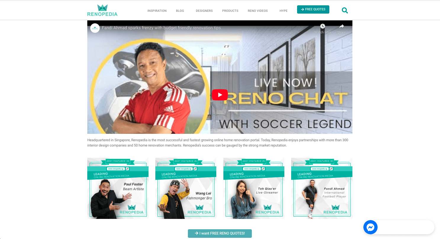
Current Renopedia Website
THE PROBLEM
Lack of Clarity
Users don’t understand what Renopedia offers at first glance.
Overwhelming content
The landing page is cluttered with excessive text and ads.
Trust issues
The website feels promotional rather than informative, making users skeptical.
Navigation confusion
Visitors struggle to find relevant services, leading to high bounce rates.
RESEARCH SUMMARY
Moodboard Creation
Users save inspiration from Pinterest, Instagram, and renovation platforms, often taking screenshots to create a moodboard for reference.
Preference for Video Content
Users trust video tours over static images, as they provide a better sense of space, design, and atmosphere.
Shortlisting Interior Designers
Different users have varying priorities: some focus on budget, while others prioritize quality, craftsmanship, and style.
Step 1: Gathering Inspiration
During this process, users are browsing and saving the inspiration for their dream home. We identify 2 main inspiration source they like:
Photos | Internet
“I search for inspiration through open source tool such as Pinterest, Instagram, or even Renovation platforms”
“I save those inspiration to create a moodboard, so I can show to the ID that this is what I want”
Video Tour | Clips
“I prefer to watch video tour or house tour of the interior design project”
“I can feel the actual atmosphere of the house better through video”
Step 2: ID Research & Shortlisting
After the users has some inspiration in mind, it’s time to search for the designer to craft their dream home. However, also comes with a lot of criteria needed to be filled.
Research ID Firm
“I like to explore through firms and designer’s previously completed projects through their websites and social media”
“I will judge if their work is similar to the style that I like”
Shortlisting ID
“I do have some ‘Budget’, ‘Craftsmanship’, ‘concept / styling’ concerns”
Step 3: Hiring Process
After users has shortlisted numbers of Interior Design firms that fits their selection criteria, users tend to outreach to find out about the IDs, prices and compare to select their best fits.
Selection Process
“I reach out to multiple firms that I like to compare the price of the quotations”
“I want to communicate directly with the ID firm”
“I chose designer base on conversation I have with them, if they understand my preference”


CHALLENGES & OPPORTUNITIES
Confusing Navigation
Users struggle to navigate and find relevant designers.
Ineffective Search & Filter
Filtering and search features don’t match user expectations.
Lack of Trust
The platform lacks trust signals and feels overly promotional.
Simplify Navigation
Create a more intuitive way to explore and save inspiration.
Improve Search & Filter
Improve filters to help users narrow down their ideal designers.
Build Trust
Build stronger trust signals to encourage engagement and lead conversion.
PERSONAS & USER STORY
Personas


User Journey

Both Struggle with Navigation
Both personas struggle with navigation, trust, and lack of transparency
Fragmented Journey
Their journey is fragmented—there’s no clear way to transition from one step to the next
Need More Intuitive Platform
Addressing these gaps will create a more intuitive, trustworthy, and efficient platform
COMPETITOR ANALYSIS

Visual-First Experience
Strong focus on images for inspiration.
Save & Organise Features
Users can save inspirations into boards.
Defined Filtering
Effective tools to refine searches.
Project Discovery
Related project recommendations improve exploration.
Overloaded Text
Some platforms present too much information at once.
Limited Designer Contact Support
No clear prompts when reaching out to IDs.
Navigation Issues
Small fonts, excessive scrolling, and inconsistent UX.
HMW & DESIGN STUDIO


Personalised Journeys
Explored Page
Enhanced Filtering
Shortlist & Inquiry Flow
Moodboard Feature
USER FLOWS

IDEATIONS

Filters (Inspiration Page)
Users can refine their search with filters to narrow down results based on style, budget, and preferences.
Helps reduce information overload and streamline decision-making.

Personalised Journey
Tailored onboarding flow to curate content specific to the user’s needs.
Provides a more structured approach to finding inspiration and designers.
Save to Moodboard
Users can save, categorise, and visualise ideas for future reference.
Creates a personalised collection of inspirations to share with designers.
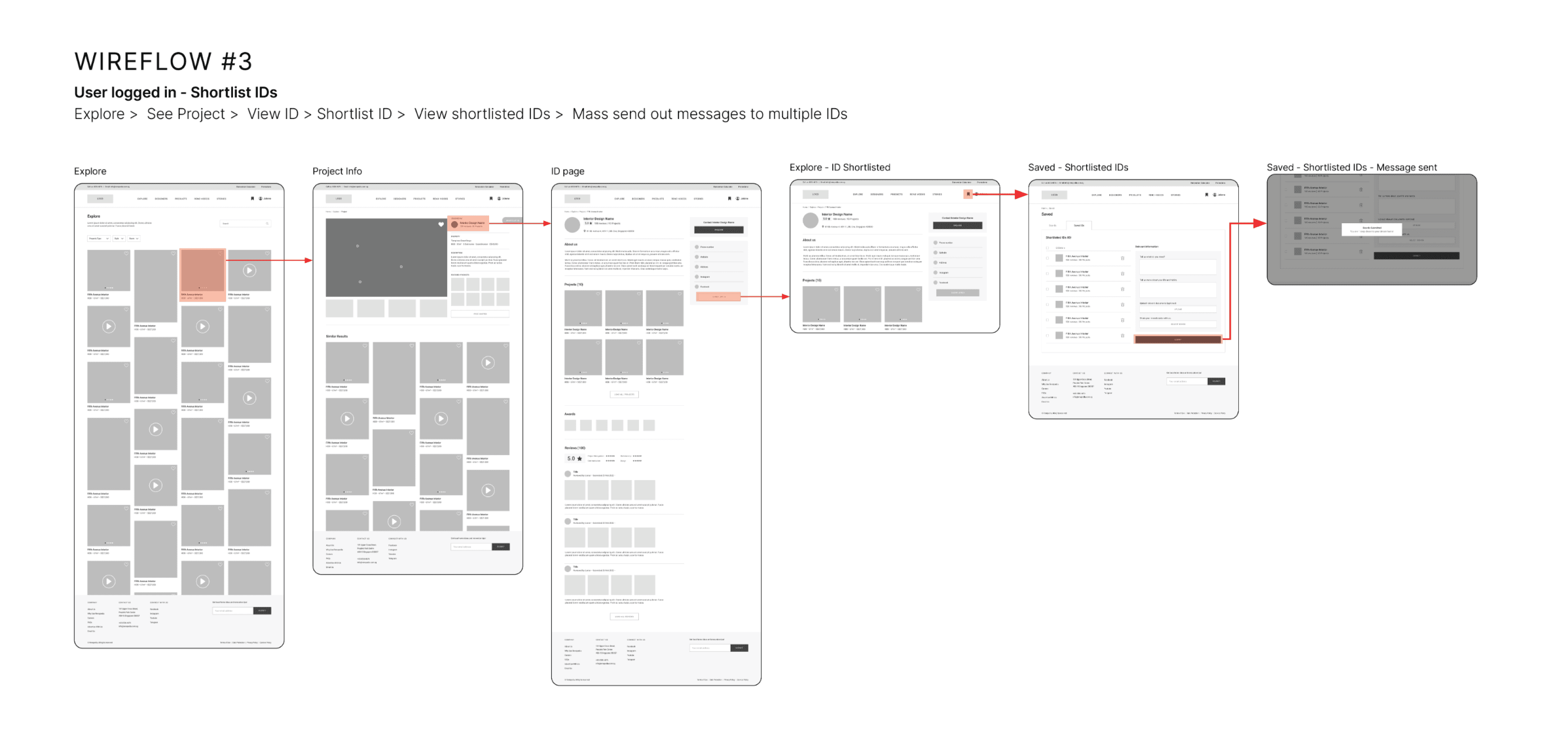
Shortlist & Enquire Feature
Users can save interior designers (IDs) of interest and mass send inquiries with one click.
Improves efficiency by eliminating the need for manual, repetitive outreach.
USABILITY TEST & REFINEMENT
Major Pain Points (3 out of 3 users)
Confused by filter options and struggled to close the filter bar.
Unclear "Shortlist ID" label – users didn’t understand its function.
Wanted alternative contact options (e.g., WhatsApp for faster responses).
Frustrated with login requirements just to save inspirations.
Additonal Issues
🔹
Confused by icons (💾 vs. ❤️) and the word "Board" in the moodboard feature.
🔹
Preferred to have pre-filled forms when inquiring via logged-in accounts.


USABILITY TEST
Successes:
Users easily navigated the platform and found inspirations faster.
The "Share" feature was well-received, especially for WhatsApp sharing.
Users could apply filters effectively and retrieve saved inspirations.
Remaining Friction Points:
🔴
1 out of 3 users wanted an option to relocate saved inspirations.
🔴
3 out of 3 users found "Free Quotes" unclear and preferred direct enquiries.
🔹
Added an option to relocate saved inspirations for better organisation.
🔹
Refined the “Free Quotes” feature to better match user expectations.
🔹
Allowed users to select which IDs to message instead of mass messaging all.
THE SOLUTION
View Prototype Here
Effortless Navigation
Users can now browse inspirations instantly with clear categories and structured content.
Smart Search & Filtering
Advanced filters help users find relevant ideas quickly.
Seamless Engagement
Users can save, share, and enquire without unnecessary barriers.


REFLECTION
✅
User-Centric Validation
Features that seem effective in theory may not align with actual user needs, highlighting the necessity of usability testing.
✅
Iterative Design Thinking
Continuous feedback loops drive meaningful improvements and ensure the product evolves based on real insights.
✅
Holistic UX Process
Understanding the complete UX workflow has given me the confidence to tackle complex design challenges in future projects.